Design Outlook: 2019 Color Trends

We are into the thick of autumn now and before we know it, we’ll be ringing in 2019. A new year always hearkens in a fresh set of design trends and Elle Décor recently composed a list of their top fifteen trends for the coming year. While 2018 “was all about bringing an edgier palette into the home,” editors at Elle Décor say 2019 will take “a more mindful, lifestyle-based approach to the development of new shades.” Below, we’ve outlined the six colors we’re most excited about from Elle Décor’s list.
A Digital Approach: Valspar “Twilight Mist”
As Sue Kim, Senior Color Designer with Valspar notes, “smart technology in the home is driving the color experience differently.” For 2019, that means we will see “higher intensity shades that mimic the edge of artificial light in a way that is ‘strangely familiar’ (and obviously gorgeous)."
Cheerful Hues: Sherwin Williams “Afternoon”
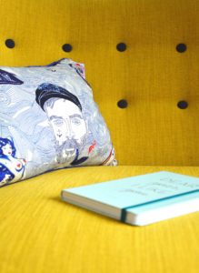
Elle Décor predicts that overall, “we’ll see a rise in colors that are associated with optimism, like bold yellows and oranges.” We like the idea of a vibrant and welcoming yellow, especially in accent furniture, which “pairs beautifully with cool blues, beiges, and pinks.”
A New Take on Forest Green: PPG “Night Watch”
A contemporary approach to the traditional forest green color brings the healing properties of nature indoors, yet avoids “feeling overly arboreal.”
Understated Blue: Valspar “Seattle Haze”
Blue is a color traditionally associated with calmness and cool tones that support creativity and intelligence. This year, we will see softer blues with “a calming grey undertone that promotes a more serene energy in the home.”
A Touch of Blush: Valspar “Blushing Bride”

Millennial pink overtook trendlines throughout 2018 and its popularity will continue in a more minimal way with “softer shades like rosy neutrals and muted blushes.” While the appeal of millennial pink was its trendiness, these new hues afford a more timeless palette.
Berry Inspired Tones: Sherwin Williams “Salute”
2018 saw a collection of bright and vibrant reds come to the fore. In 2019, these will shift into “bold, saturated reds that infuse life into a space without overwhelming it.” Berry shades nod to comfort and coziness while adding energy to a space.
Haven’t satiated your palette yet? Explore more 2019 color trends here.